Perfect for beginners and pros alike — the premium UI kit for solo designers, freelancers, startups, agencies and organisations
Premium Pixels will help you learn pro-level design principles and Figma best practices, save time, design consistently, deliver projects faster, earn more, and unite teams for seamless collaboration. Premium Pixels will help you become a 10x designer.
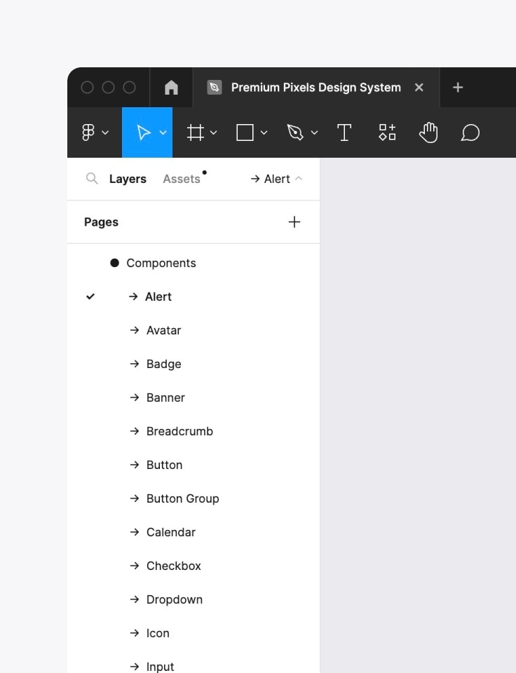
A growing library of UI components for professional product design. Pixel-perfect, easily customizable, and built using the latest Figma features.
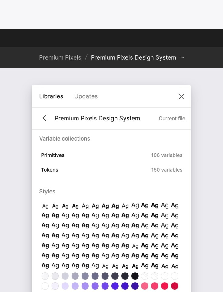
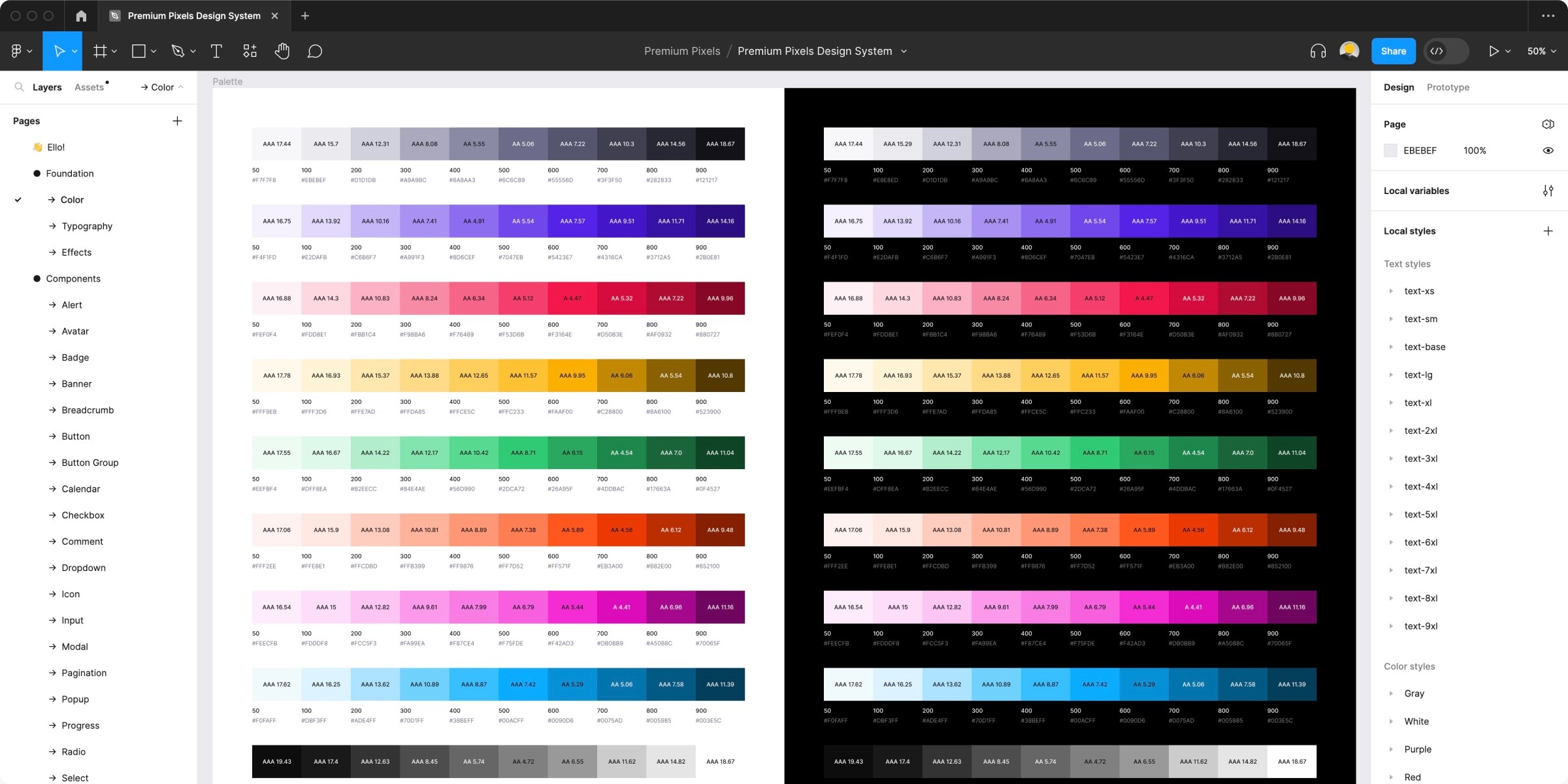
An intelligent design system built with Auto Layout, components, properties, variants, variables (design tokens), and modes (light/dark).
Easily customize styles to fit your brand with a few clicks. Adjust typography, colors, effects, and variables just once to update the entire library.
Get new UI components, patterns, and layouts every month and enjoy an ever-expanding design system that never stops evolving. Sit back and relax while we design for you.
Design 10x faster with a ready-made, well-organized component library — pixel-perfect, super-smart, and versatile as standard
Stop wasting your time re-inventing the wheel by rebuilding the same UI components. We've built everything you need to kickstart any product design project.
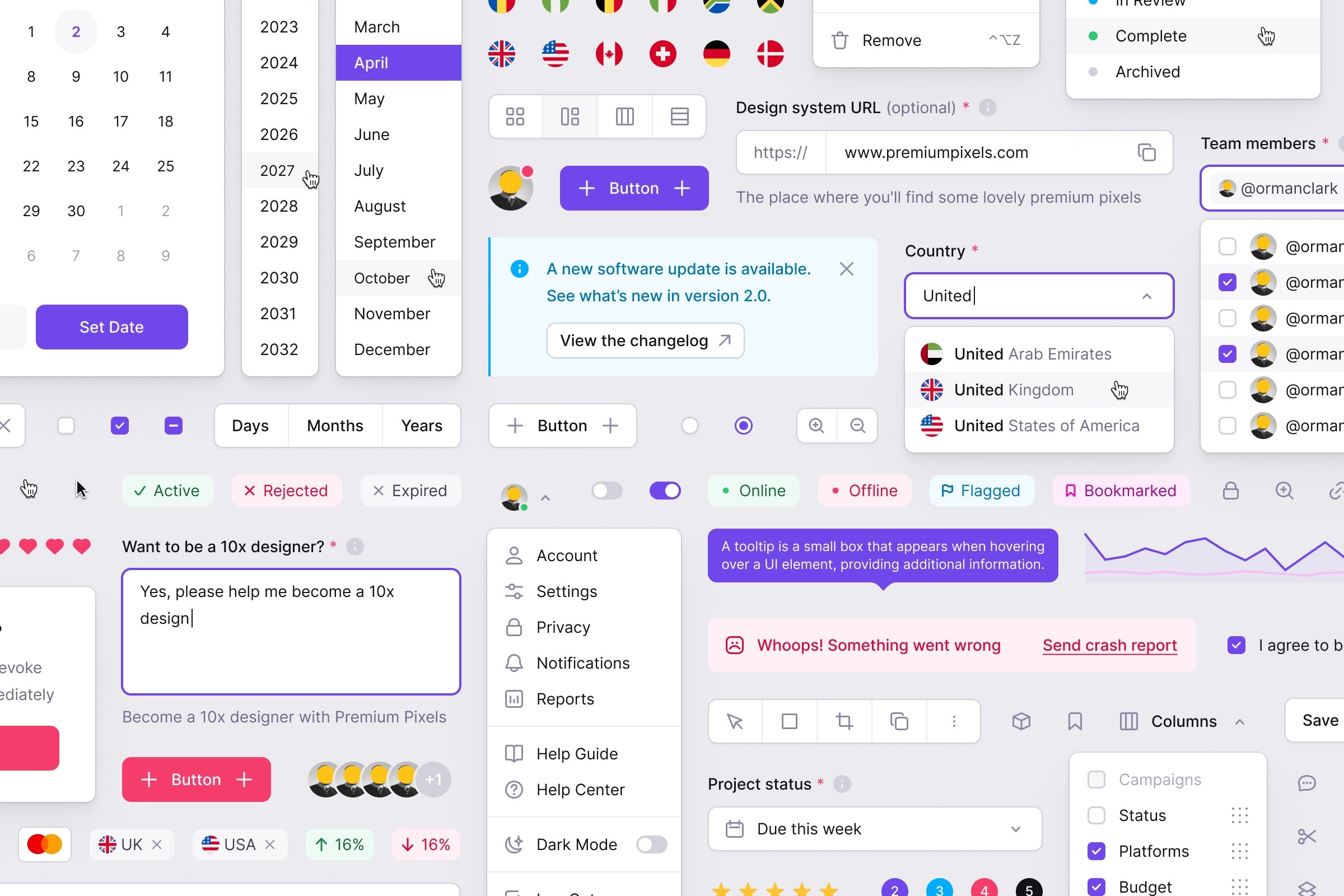
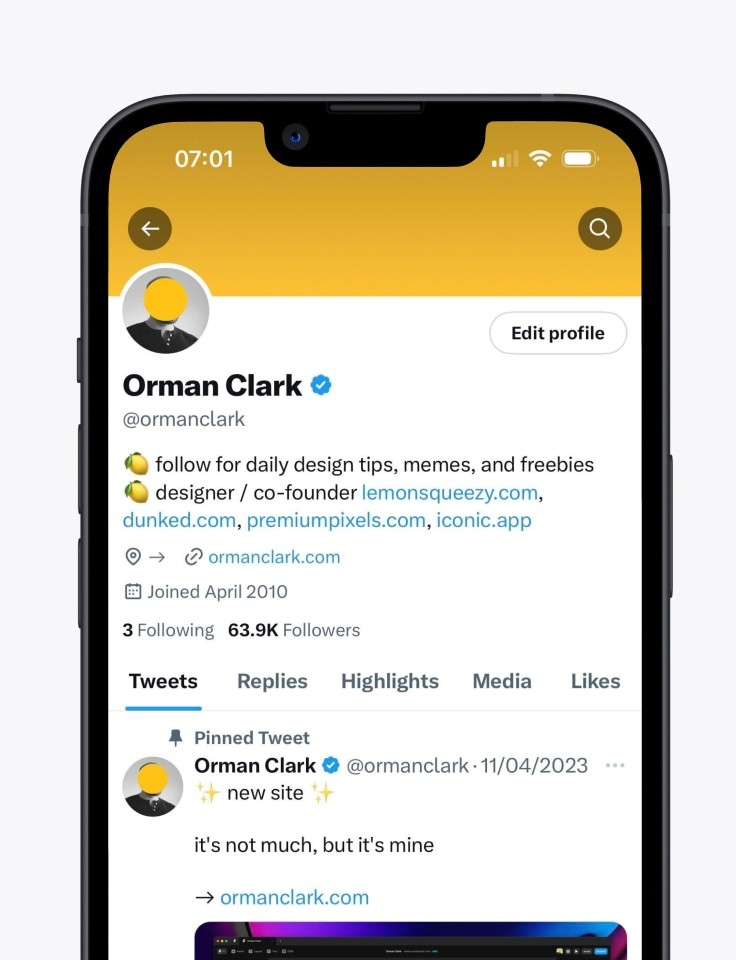
Meticulously crafted, production-ready components that will speed up your design process and simplify maintenance. Need a new component? Let us know. We'll design it with unmatched attention to detail. Skip the redundant work and go straight to problem-solving.
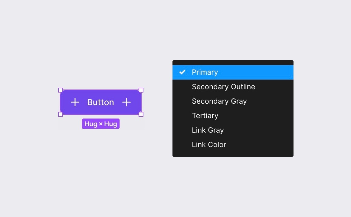
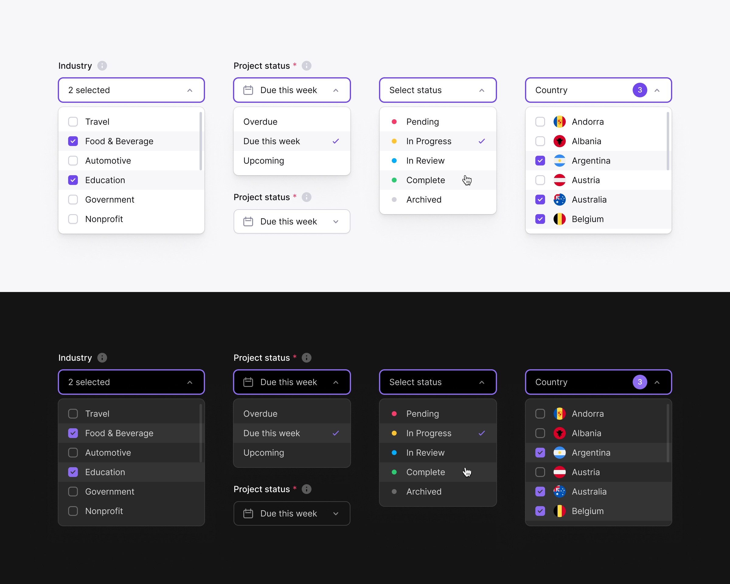
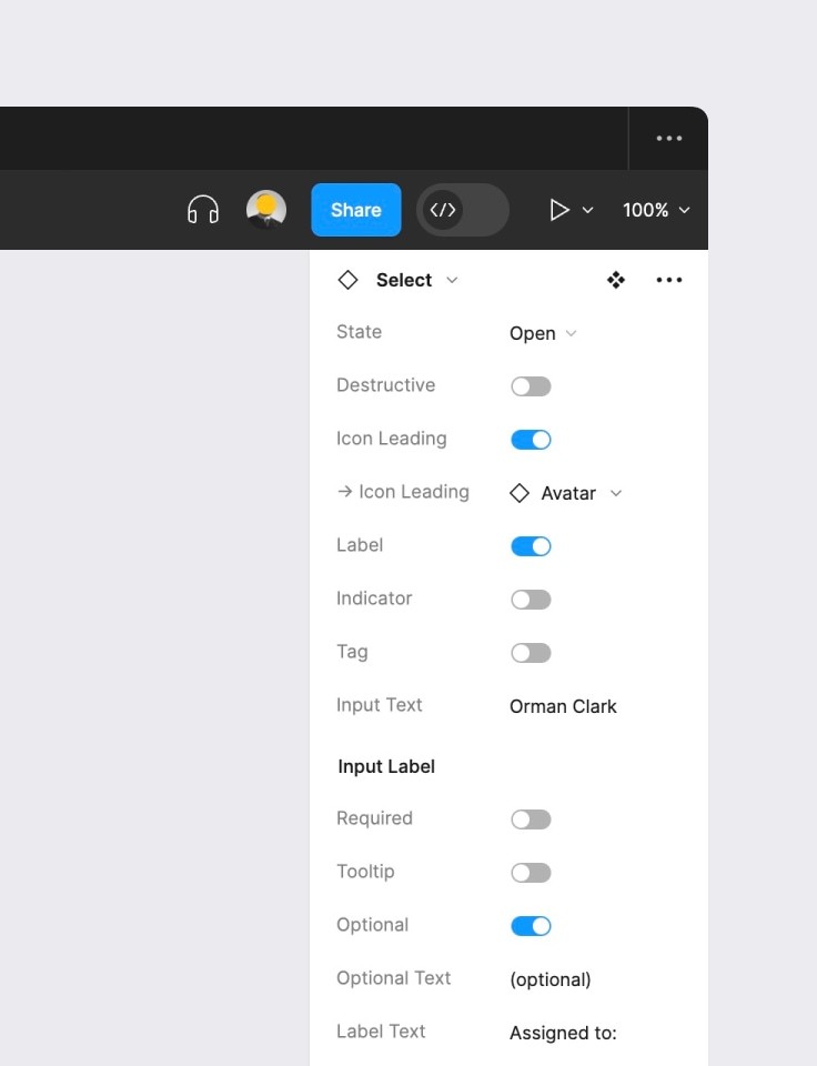
Component variants give you control over the styling and configuration of your application. Customize your UI quickly and easily, and switch between variants in an instant.
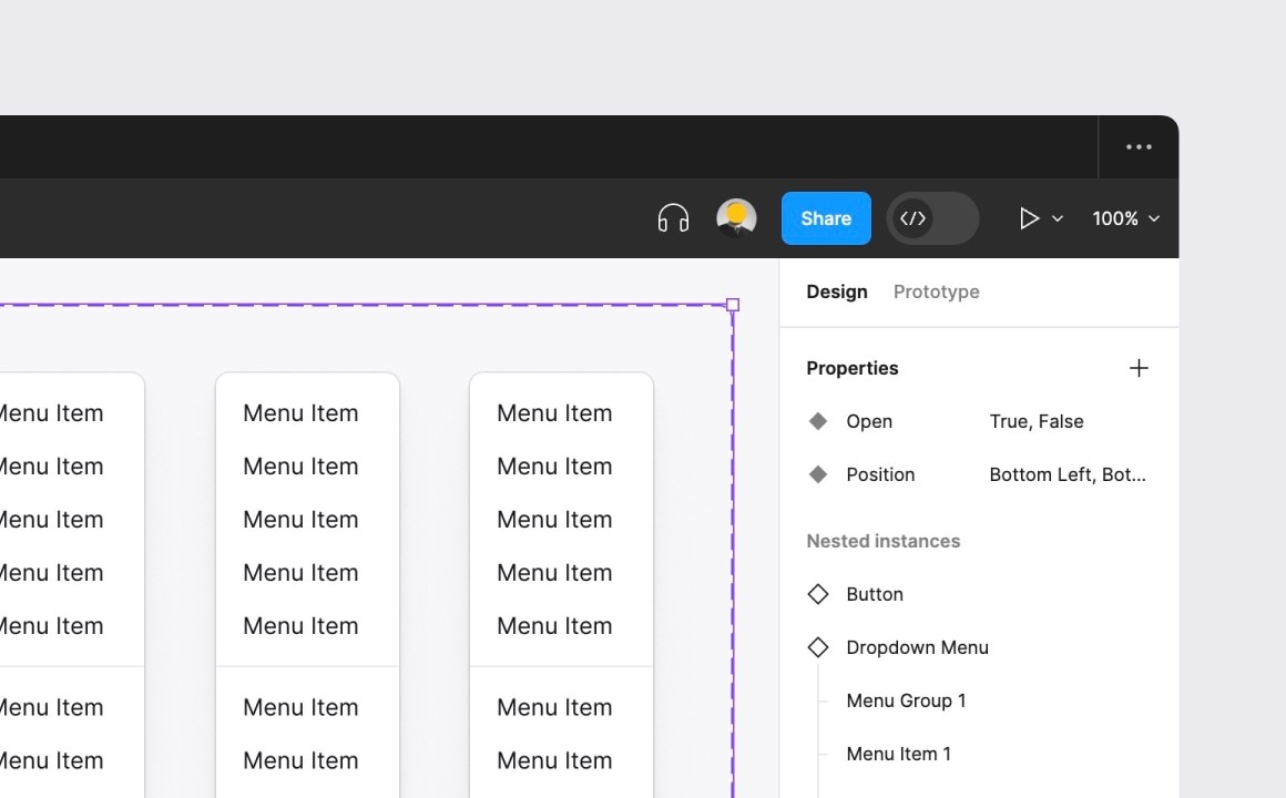
Component properties let you customize each component with simple toggles, switches, and overrides. Nested instances will make you feel like a pro.


A selection of components to whet your palate. We add new components every month and take requests.
Customizable to the nth degree — apply your brand styling to the entire library in seconds
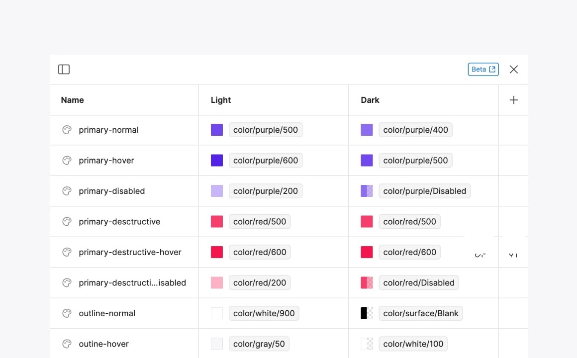
Quickly and easily customize the design system to match your brand by adjusting typography, colors and effects. Take it one step further with variables (design tokens).
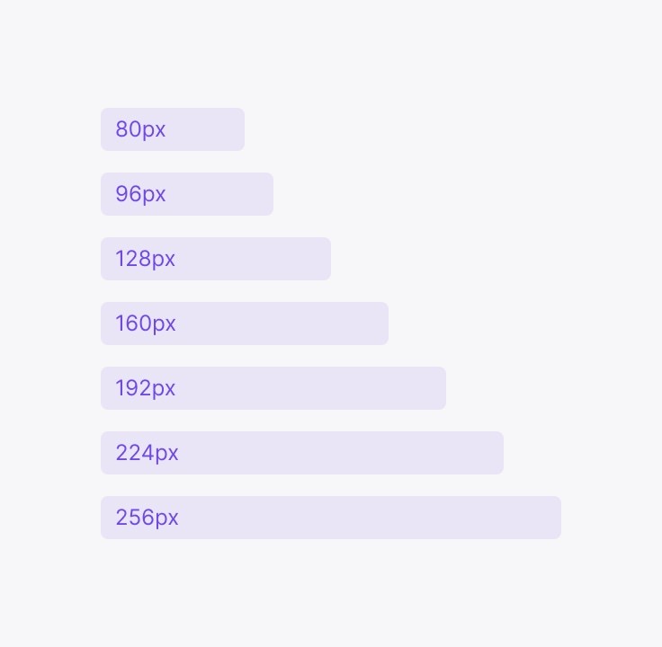
Designed to a soft 4px grid for consistent layout and spacing.
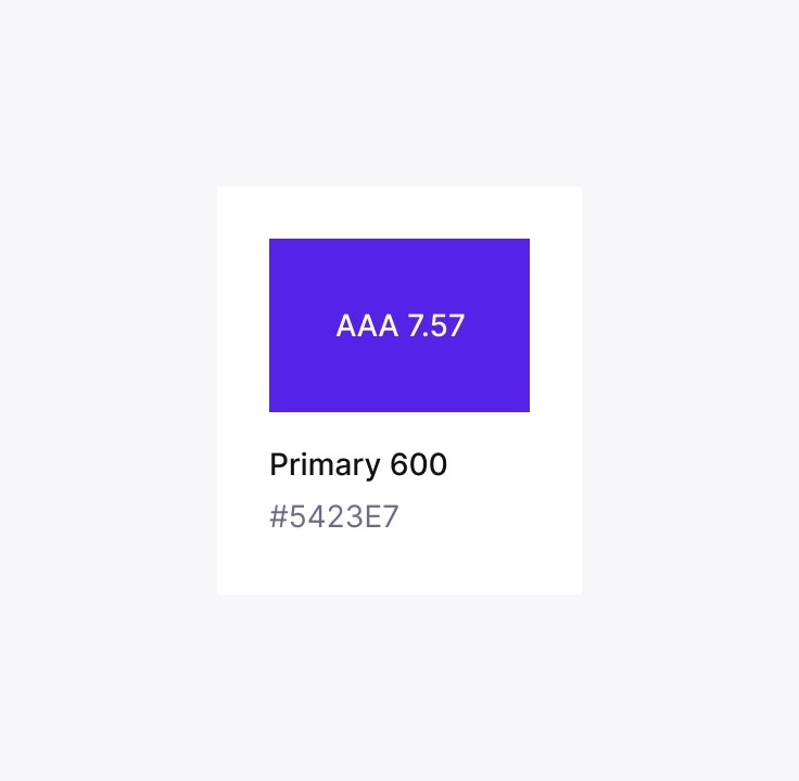
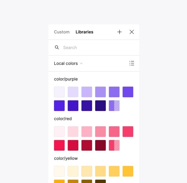
An accessible color palette with WCAG 2.1 compliance as standard.
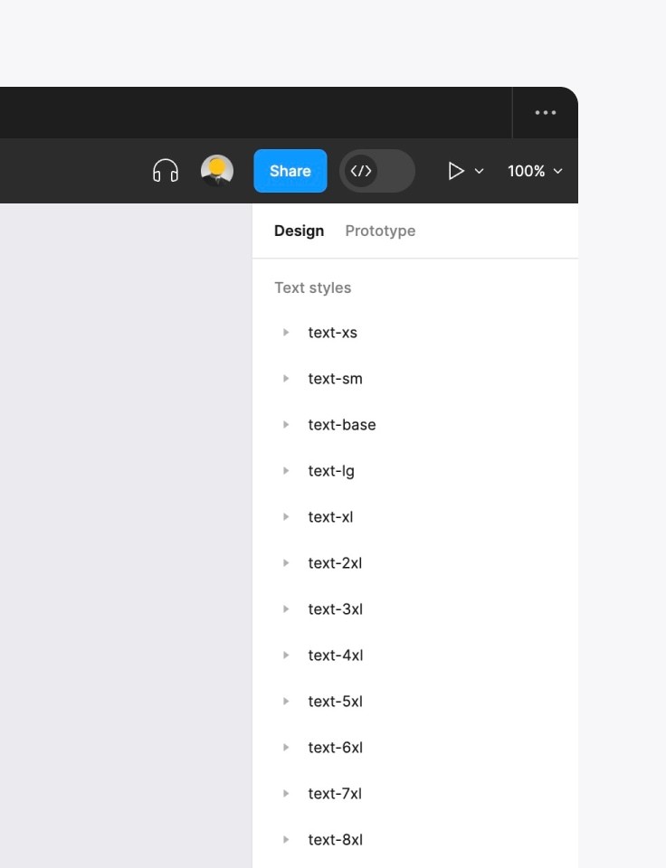
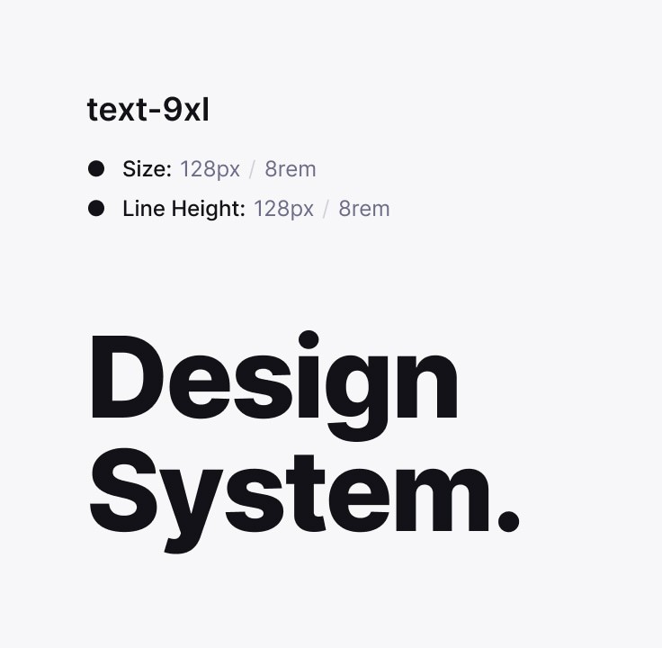
A scalable typography system with editable fonts, sizes and line heights.
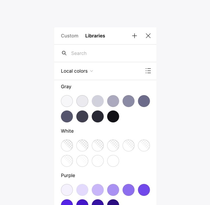
Switch between colour styles instantly for quick and easy customization.
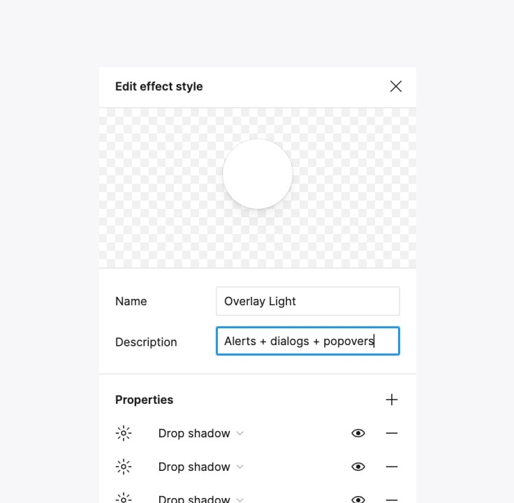
Use shadows and other effects to enhance your designs.
Adjust variables (design tokens) for granular control.
Iconic iconography for all occasions — stop wasting time looking for the perfect icons and use a best-in-class icon library
Premium Pixels comes bundled with 200 icons from the iconic icon library. Beautiful 24x24px icons designed by the best in the business. Icons don't get better than this.
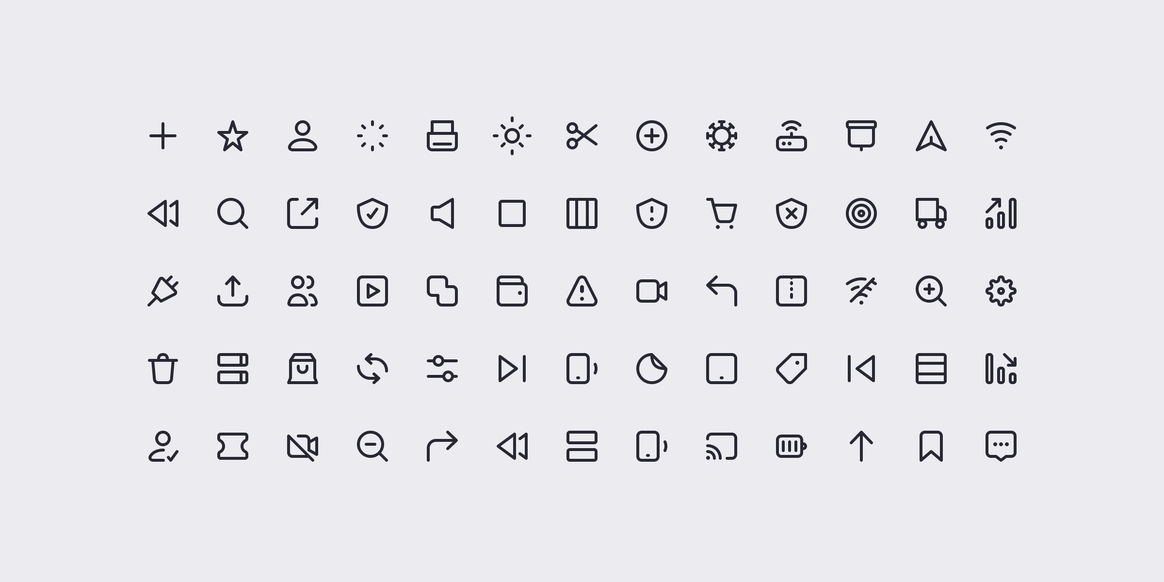
A full range of clean, consistent, premium icons spanning multiple categories. Made in Figma, for Figma.
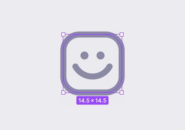
Skillfully designed with 1.5px strokes on a 24x24px grid. Icon perfection.
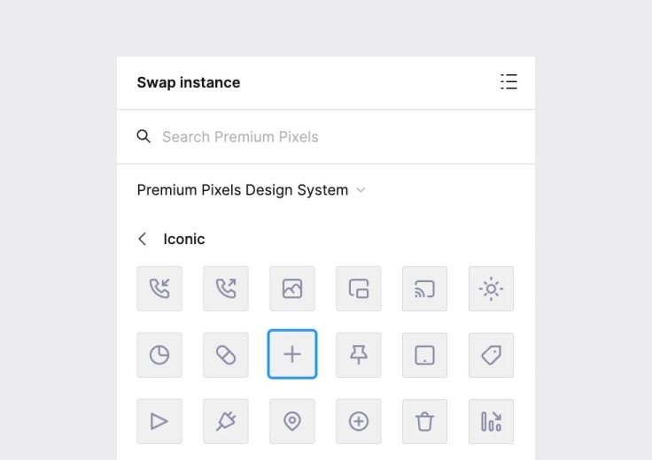
Find and swap icons without leaving Figma. Search less, design more.
Helpful utility icons will save you oodles of time. Super-handy.
Dark mode all the things — enable dark mode on your designs with the flick of a switch
Easily switch your designs between light and dark modes using powerful Figma variables. Dark mode is no longer an afterthought. It's automatic.
All components are available in light and dark modes by default and can be switched anytime.
Create multi-brand themes and modes with Figma variables. Go from minimalist to brutalist in seconds.
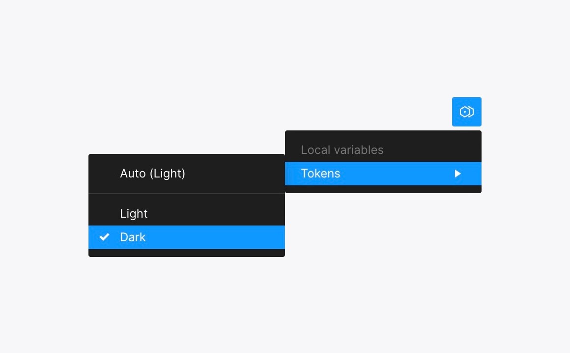
Quickly toggle between modes or set components to switch automatically based on their environment.
The smartest design system on the planet — built using the latest Figma features
Keep your knowledge and skills up to speed with the latest Figma features and best practices and deliver your best work. As Figma evolves, you and your designs evolve.
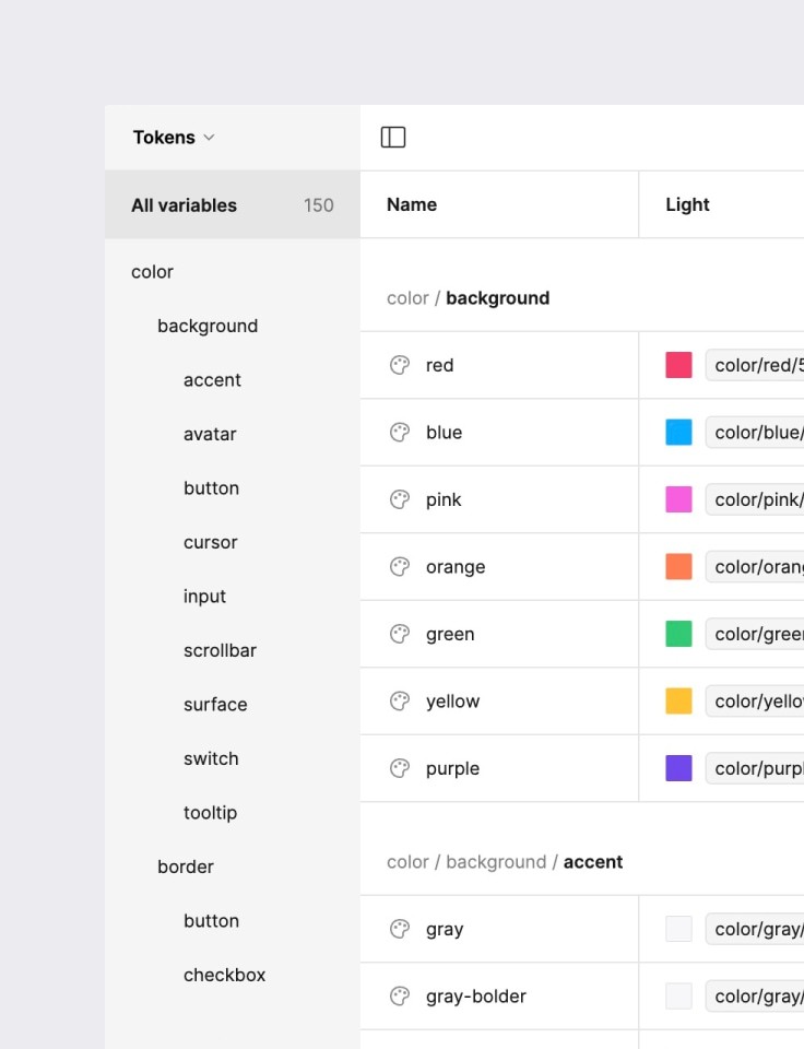
Figma variables store values that can be applied to different properties and combined to create modes.
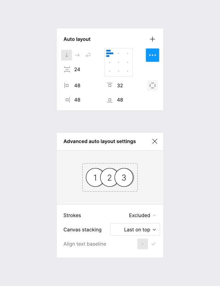
Auto Layout 4.0 allows your designs to be fully responsive and shrink, grow, and wrap to fit their containers.
Components and properties simplify maintenance and offer lightning-quick configuration and customization.
Pre-order now open! Reserve your hugely discounted copy of Premium Pixels today and we’ll deliver it to your inbox on launch day
** Hurry, early bird discount ends soon **